CMYK vs RGB for Beginners
Understanding color beyond the basics
At some point in every designer’s journey, colors stop behaving the way you expect them to. What looked vibrant and precise on your screen suddenly feels dull, muddy, or simply wrong once it’s printed. This moment is not a failure of taste or skill. It is usually the first real encounter with the difference between RGB and CMYK.
This article is not meant to overwhelm you with color science. Its purpose is to give you clarity. To explain why these systems exist, why they clash, and how designers learn to work within their limits instead of fighting them.
The simple rule most designers learn first
Early on, designers are taught a rule that sounds almost too simple:
- RGB is for screens
- CMYK is for print
This rule is correct, and for a long time, it is enough.
Screens emit light. Printers apply ink to paper. Because the mediums are different, the color systems built for them are different as well. If you remember nothing else at the beginning of your career, remembering this distinction will save you from many avoidable mistakes.
But as your work becomes more detailed and your expectations rise, this rule starts to feel incomplete.
Why colors start to feel inconsistent
After some experience, you begin to notice something subtle but important. Not all reds are the same. Not all blues feel equal. A color that looks rich and energetic on screen can lose its strength entirely when printed.
This is where the real issue reveals itself:
RGB cannot fully represent CMYK, and CMYK cannot fully represent RGB.
These systems overlap, but they are not the same world. Some colors that exist comfortably in RGB simply do not exist in CMYK. When those colors are forced into print, compromises are made. Brightness is reduced. Saturation drops. Contrast shifts.
This is not a software bug. It is a physical limitation.
Screens are not showing you the truth
Most design work happens on screens, but screens do not show true printed color. Even the best displays are still simulations.
A screen creates color by adding light. Paper shows color by reflecting light. Because of this difference, your screen is always an approximation of what ink will do on paper.
Better monitors and proper calibration can bring you closer to reality, but they can never remove the gap entirely. This becomes more noticeable as your work becomes more refined and color-critical.
The frustration phase every designer hits
At some point, almost every designer goes through the same experience.
You design carefully on your computer. You choose colors with intention. You zoom in, adjust values, and make sure everything feels balanced. On screen, the work looks finished.
Then it gets printed.
The result feels disappointing. Bright colors appear muted. Electric tones lose energy. Neons turn flat or muddy. You may wonder what went wrong, or assume the printer made a mistake.
But by now, the reason should be clearer. The design did not fail. The translation did.
Why some printers ask for RGB files
This frustration is also why some printers recommend designing in RGB.
Certain modern print systems use extended color processing. These systems convert RGB files internally, using profiles tailored to their specific machines. In some cases, this can produce results that look closer to what you saw on screen.
However, this approach depends entirely on the printer. Not all printers work this way, and not all printing methods support it.
Traditional offset and press printing do not benefit from this workflow. In those cases, designing in CMYK from the beginning is still the correct approach.
Managing expectations instead of chasing perfection
There is no single solution that guarantees perfect color across every medium. Professional results come from combining good practices, not from relying on one system or shortcut.
Designers who grow comfortable with color learn to do three things well:
- Accept that screens are approximations
- Design within the limits of the final medium
- Communicate clearly with printers and clients
Color accuracy is less about control and more about understanding constraints.
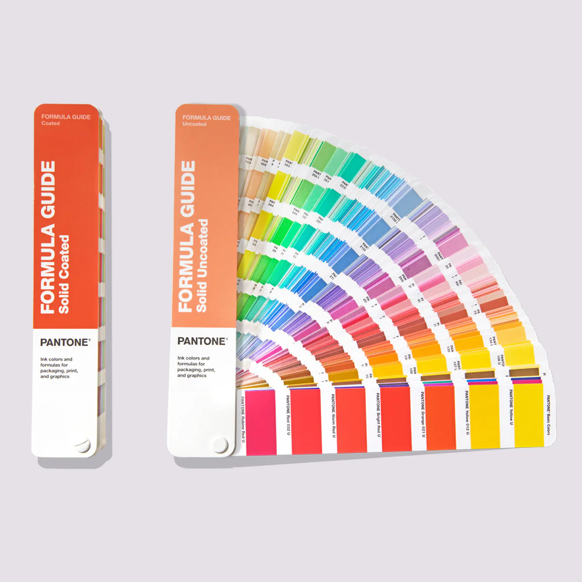
Why this matters before learning Pantone
Many designers jump to advanced systems too early, hoping for complete accuracy. But without understanding RGB and CMYK first, those systems can feel confusing or disappointing.
RGB and CMYK are not inferior tools. They are foundational ones. If you want to go deeper into standardized color systems and understand when absolute consistency matters, you can continue with Pantone for Beginners. Learning their strengths and limitations prepares you to make informed decisions later, instead of chasing guarantees that do not exist.
The real takeaway
RGB and CMYK are not enemies. They are systems designed for different realities.
As a designer, your role is not to eliminate that difference, but to work intelligently within it. Once you accept that some loss and translation is inevitable, color stops being a source of frustration and becomes a deliberate design choice again.
That understanding is what separates early-stage designers from confident ones.