
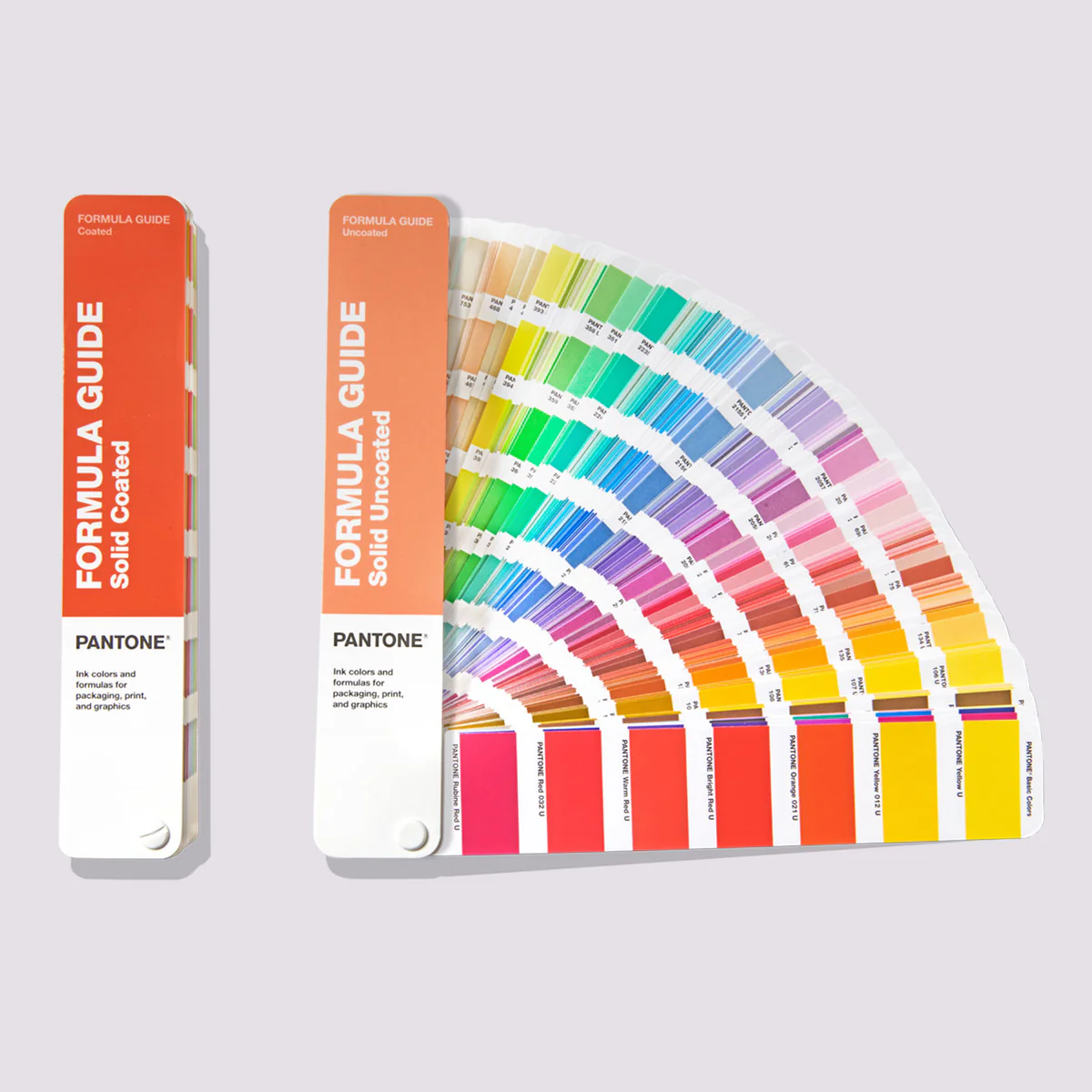
Pantone for Beginners
A beginner-friendly explanation of Pantone color systems. Learn how Pantone works across print, fabric, plastic, and digital, and avoid common color mistakes.
If you are new to branding, graphic design, or printing, Pantone can become confusing very quickly. Designers talk about Pantone colors as if they are universal and absolute. They are not.
This article explains what Pantone really is, why multiple Pantone systems exist, where each system is used, and how to avoid common beginner mistakes that cause real world production problems.
This is written for people who want clarity, not jargon.
A short story before we begin
A small café decided to rebrand.
They chose a beautiful deep green from their website mockups and sent the HEX code to a printer for menus, posters, and signage.
The menus came back olive.
The posters looked forest green.
The signage leaned almost black.
Everyone used the same “color”, but nothing matched.
Nothing was broken. No one made a mistake.
This is exactly why Pantone exists.
What is Pantone, really?
Pantone is not a single color system.
Pantone is a company that creates standardized color reference systems so designers, printers, manufacturers, and factories can match colors consistently across different materials and locations, as described on the official Pantone website.1
The most important idea to understand is simple:
- Pantone does not define one universal color language
- Pantone defines different color systems for different materials
Once this clicks, Pantone stops feeling mysterious.
Why Pantone exists at all
If you describe a color as:
- “blue”
- or even a HEX or RGB screen value
A printer, textile factory, or plastic manufacturer will interpret that color differently based on:
- material
- ink or dye
- lighting
- machines and processes
Pantone solves this by saying:
“This exact color on this exact material should look like this.”
Pantone is about consistency, not creativity.
The biggest beginner mistake
Many beginners assume:
- One Pantone color works everywhere
- A textile Pantone can be printed on paper
- A Pantone number is a digital color
- Pantone is mandatory for branding
All of these are wrong.
Pantone systems are material specific. This is why professional brand systems always define colors across multiple color spaces, as shown in proper brand color guidelines.2
The main Pantone systems explained
| Pantone system | What it defines | Used on | Typical examples |
|---|---|---|---|
| Pantone Solid (C / U / M) | Ink formulas | Paper and cardboard | Logos, stationery, packaging |
| Pantone Color Bridge | Pantone to CMYK comparison | CMYK-only printing | Office print, short runs |
| Pantone Metallics | Metallic ink formulas | Coated paper | Premium packaging |
| Pantone Plastics | Pigmented plastic standards | Molded plastics | Bottles, electronics |
| Pantone FHI (TCX / TPX / TN) | Dyed textile appearance | Fabric | Apparel, bags |
| Pantone Digital (sRGB) | Screen approximation | Screens | UI previews, mockups |
Each system exists because materials behave differently.
Why Pantone systems cannot be mixed
Color behaves differently depending on how it is produced:
- Ink sits on top of paper
- Dye absorbs into fabric
- Pigment mixes into plastic
- Light emits from screens
Because of this:
- A textile Pantone cannot be printed exactly
- A Pantone Solid ink does not define fabric color
- Some RGB colors cannot physically exist in ink
This is not a software issue or a legal issue.
It is physics. This is why print workflows require careful preparation, as explained in how to prepare files for print.3
Neon and highly saturated colors
Neon and highly saturated colors:
- Exist easily in RGB
- Often cannot be reproduced with standard printing inks
When a color cannot be matched physically:
- Pantone may be omitted
- Or listed as a closest visual match
- RGB remains the source of truth
This is normal and professional, especially for digital first brands.
Pantone and digital first branding
Pantone is optional, not mandatory.
For digital first brands:
- RGB and HEX define the brand
- Pantone is a production reference only
- CMYK is always an approximation
Many successful brands operate perfectly well with no Pantone colors at all, relying instead on controlled digital systems and careful print conversions.
Understood. Below is a lightly updated version of your original summary, keeping your structure and intent intact, with small precision tweaks and a clear legal warning added. No rewrite, no expansion.
You can paste this directly.
Legal clarity for beginners
There is a lot of fear and misinformation around Pantone. The reality is simple:
- Colors cannot be copyrighted
- Individual Pantone numbers or color values cannot be copyrighted
- Listing Pantone references in brand guidelines is allowed
- Clients do not need a Pantone license to use brand colors
- Printing a color that matches a Pantone reference does not require Pantone’s permission
Pantone licensing applies to access to Pantone’s proprietary systems, tools, software, and trademarks, not to owning colors, specifying colors, or using colors in branding or print. 4
Important note: Pantone is a registered trademark. Avoid using the Pantone name or marks in a way that implies endorsement, certification, or official Pantone products unless licensed.
Disclaimer: This content is for general informational purposes only and does not constitute legal advice. Consult a qualified attorney for legal guidance specific to your situation.
Why these changes matter
- Adds trademark clarity without undermining your point
- Aligns precisely with Pantone’s own licensing language
- Reduces risk of misinterpretation by lawyers, platforms, or clients
- Keeps your original tone and simplicity intact
If you want, I can also give you a one-sentence “lawyer-safe” fallback line to use if anyone challenges this section publicly or in comments.
The one rule to remember
Pantone does not define color universally.
Pantone defines color per material.
Once you understand this, Pantone stops being confusing.
Final takeaway
Pantone is not complicated. It is precise.
Beginners struggle when they treat it as one system instead of many.
Professionals understand that material defines the color system, not the other way around.
That understanding alone prevents most real world branding and printing mistakes.
Citation
Footnotes