Designing for Instagram Formats: How to Create Content That Doesn’t Break
Why Instagram keeps changing formats
If you have been creating content on Instagram for a while, format changes probably feel exhausting. Feed ratios change. Grid previews update. Reels, posts, and covers shift in how they are displayed.
These changes are not random.
Instagram evolves formats based on user behavior, not design convenience. As people scroll, pause, watch, and interact differently, layouts are adjusted to support attention and engagement. Design formats follow behavior, not the other way around.
Understanding this removes frustration. Change is not a mistake. It is the system working as intended.
The real problem is not sizes, it’s assumptions
Most content breaks because it is designed with the wrong assumption: that there is one correct size.
When content is designed tightly to a single ratio or preview, any update feels destructive. The issue is not the new format. The issue is designing without flexibility.
Formats are temporary containers. Strong content is designed to live comfortably inside them.
How Instagram formats actually work
Instagram formats are containers, not canvases.
Instagram controls how content is cropped, previewed, and framed across feeds, grids, and tabs. Designs that rely on edges, exact framing, or dense layouts are fragile. Designs that respect boundaries survive.
This applies to feed posts, carousels, reels, and stories.
Instagram content sizes you should actually use
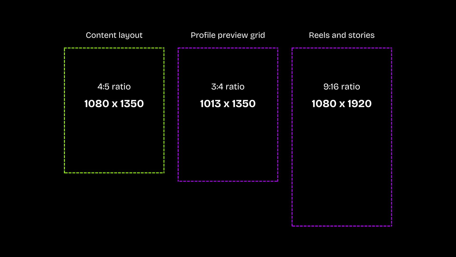
Use 4:5 (1080×1350) for feed posts, carousels, and posters, but keep all important content inside the center 3:4 area so previews stay consistent across old and new grids.
For Reels and Stories (9:16), design using 3:4 as the safe margin, treating the top and bottom as buffer so thumbnails and grid previews never feel cropped or overdesigned.
Important: Instagram does not allow direct uploads at 3:4. That ratio only exists as a preview crop.
Below are the current, reliable sizes to design with. These are the formats Instagram consistently supports, regardless of how previews change.
| Content type | Size (px) | Ratio | What this is for |
|---|---|---|---|
| Square post (legacy) | 1080 × 1080 | 1:1 | Old content and fallback viewing |
| Feed post / Carousel | 1080 × 1350 | 4:5 | Primary feed content (recommended) |
| Grid preview (do not design for) | ~1013 × 1350 | 3:4 | How some profiles preview content |
| Reels / Stories / Lives | 1080 × 1920 | 9:16 | Full-screen vertical content |
Why grid previews cause confusion
Grid previews are not a format you can design for directly.
Some users see square previews. Others see taller previews. Instagram controls how previews appear, and this behavior varies by account, update, and device.
Because previews are inconsistent, designing specifically for the grid leads to fragile layouts. Instead, use the size table above to choose the correct content format, then design within its safe margins so the content holds across feed, grid, and future preview changes.
Grid behavior is something to account for, not something to design toward.
Why profile grid previews are misleading
Many creators design primarily for the profile grid.
The grid is a summary view, not the main experience. Most engagement happens in the feed, explore page, or reels tab. Designing for the grid optimizes for the least important moment.
When grid layouts change, grid-first designs fail. Content-first designs do not.
The practical safe-area rule
When designing any Instagram content:
- Use 4:5 (1080 × 1350) as the primary canvas for feed posts and carousels
- Create Reels and Stories at 9:16 (1080 × 1920), but treat 3:4 as the internal safe margin
- Keep text, faces, and critical elements inside the 3:4 area, not at the edges
- Treat the extra space above and below as buffer space, not content space
Important elements should never depend on full-height placement or tight edges. If the content remains clear within the 3:4 safe zone, it will display consistently across old grids, new previews, thumbnails, and future layout changes.
A repeatable build order
Use this order every time:
- Write the message in one sentence.
- Design text-only first.
- Establish hierarchy (size, weight, spacing).
- Introduce visuals.
- Add decoration only if nothing breaks.
This prevents edge-dependence and forces clarity before aesthetics.
One design can then survive feeds, grids, reels, and future formats without redesign.
Common mistakes beginners make
- Designing edge to edge with no margins
- Locking important text into corners
- Treating format updates as emergencies
- Chasing trends before understanding structure
These mistakes come from focusing on tools instead of systems.
How this connects to branding
Brands that struggle most with Instagram format changes often lack a clear system.
When branding is built on rigid visuals, adaptation feels like compromise. When branding is built on purpose, structure, and principles, adaptation feels natural.
Content that survives change is a branding outcome, not a formatting trick.
The long view
Instagram will continue to change. Formats will continue to shift.
Creators who chase specifications will always feel behind. Those who design with systems, clarity, and flexibility will keep moving forward.
Design for the container, not the moment.