
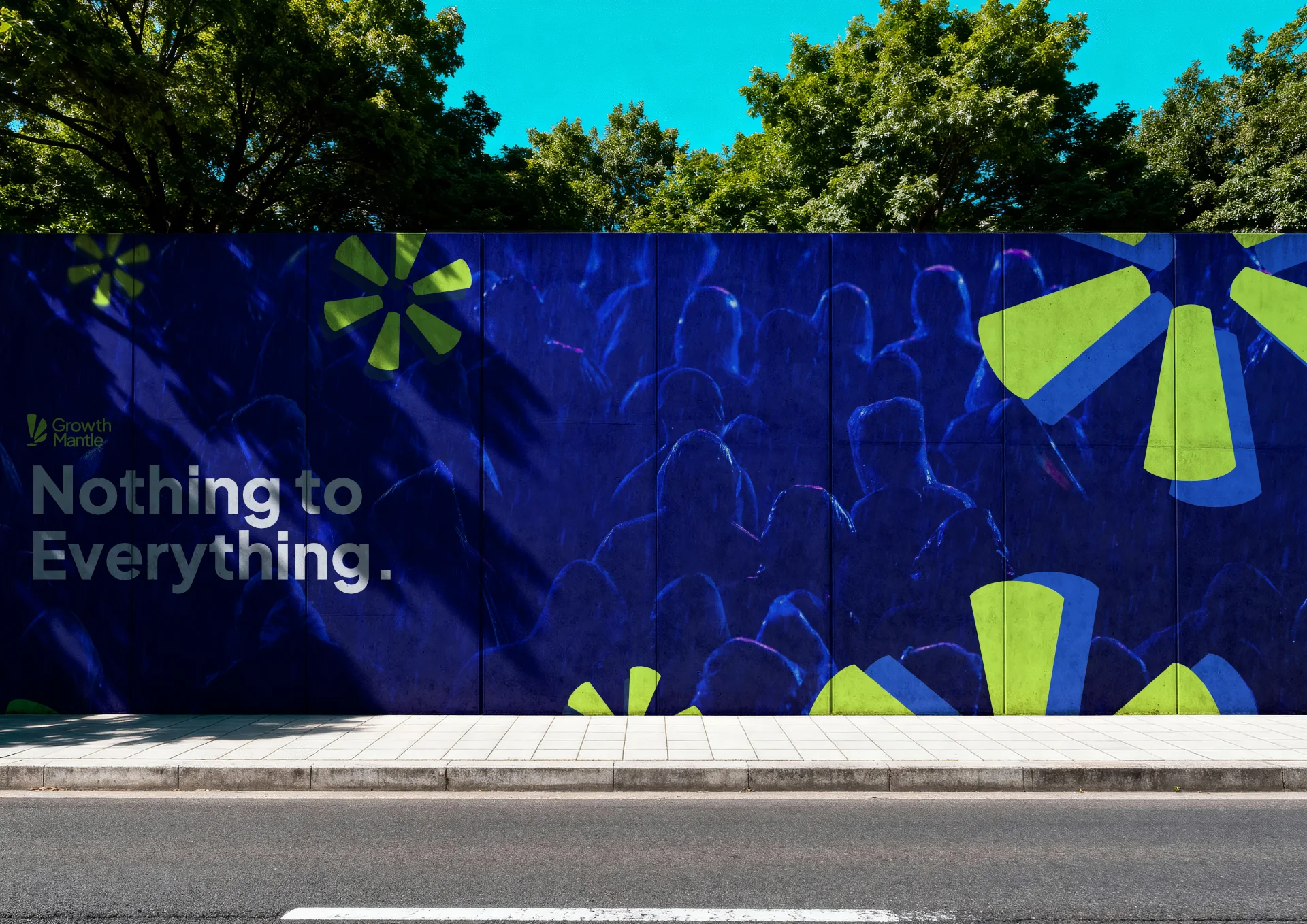
Growth Mantle Identity: Building Confidence Through Atmosphere
Aganta Foundry designs a brand identity for performance marketing agency Growth Mantle, trading graphic devices for scale, mist, and blue-hour light.
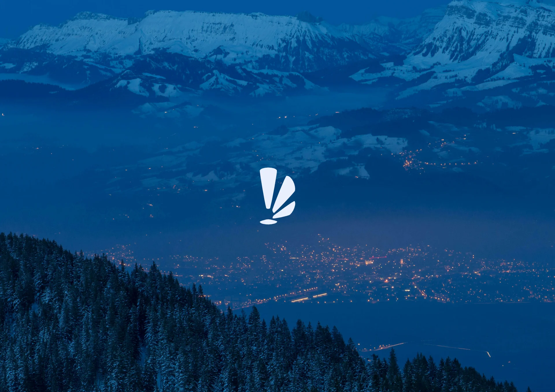
Most agency brands try to look busy. Charts, arrows, upward lines, the visual shorthand for "we get results." Growth Mantle, a performance marketing agency built on outperforming bigger, pricier competitors, needed something else. Not proof of activity. Proof of composure. Aganta Foundry built the identity around a single idea: let the brand feel vast and unshaken, and let everything else follow from that.
Atmosphere Over Iconography
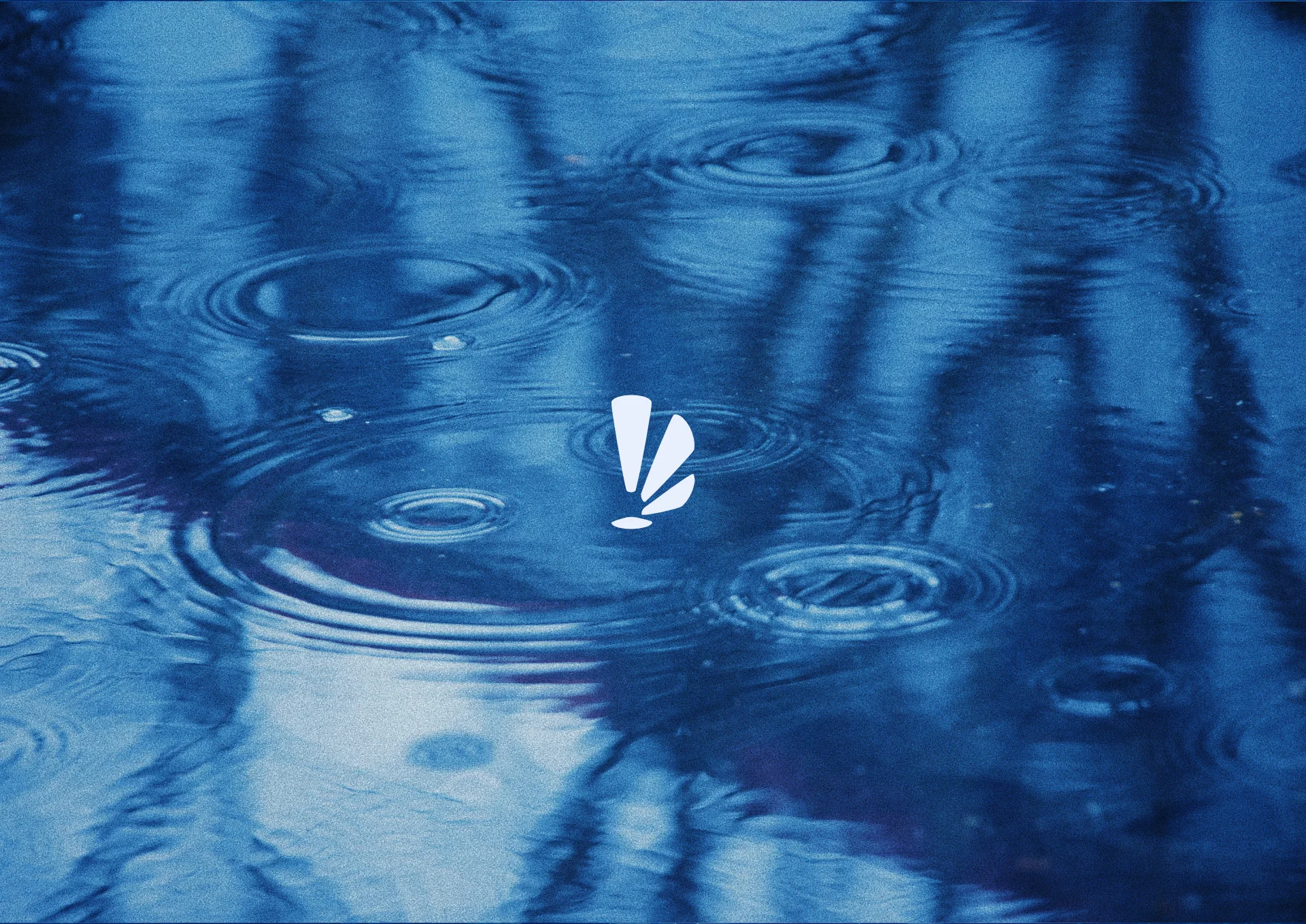
Nothing in the system is literal. There are no charts, no upward arrows, no dashboard mockups pretending to be brand assets. Instead, the identity lives in environments: snowbound mountains at dusk, marbled water, rain on glass, a city glowing under fog. None of it illustrates marketing. All of it produces a feeling, the sense of standing somewhere vast and quiet.
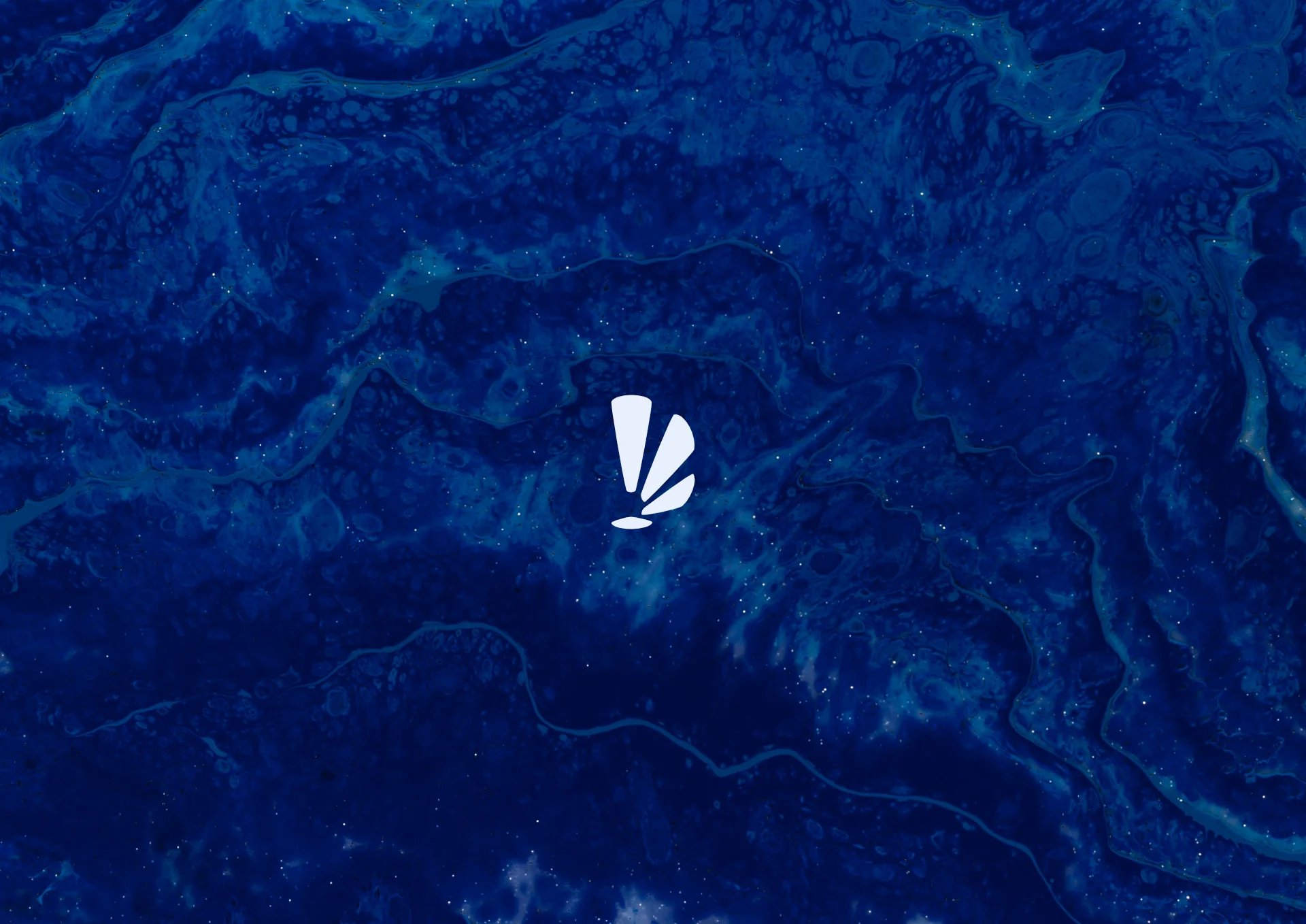
That's a deliberate substitution. Scale does what a stat block can't. It makes the viewer feel small, and against that scale, the single logo mark becomes the one human-scale point in the frame. It doesn't compete with the image. It anchors it.
A Mark That Behaves Like Light
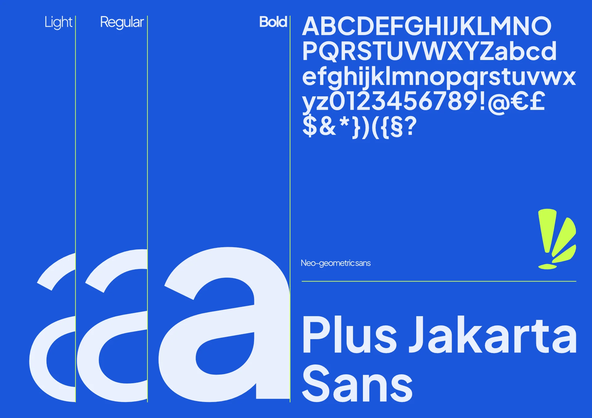
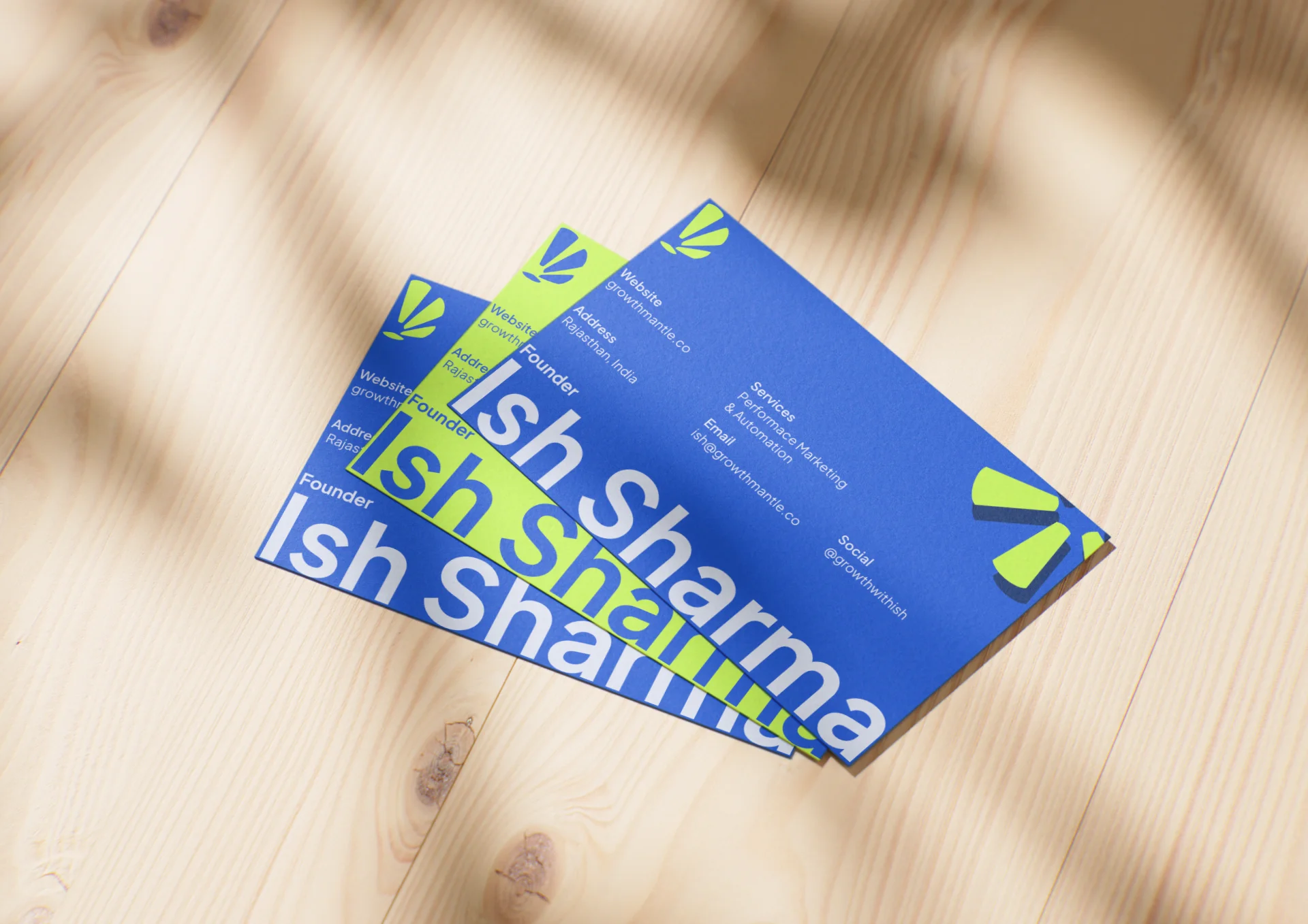
The Growth Mantle mark, three shapes fanning from a single point, reads differently depending on where it lands. On deep navy, it sits like a beacon. On a business card, it becomes a signature. It's never treated as a rigid icon bolted to a grid. It floats, the way a light source would, present but never fighting for attention.
Color as State, Not Palette
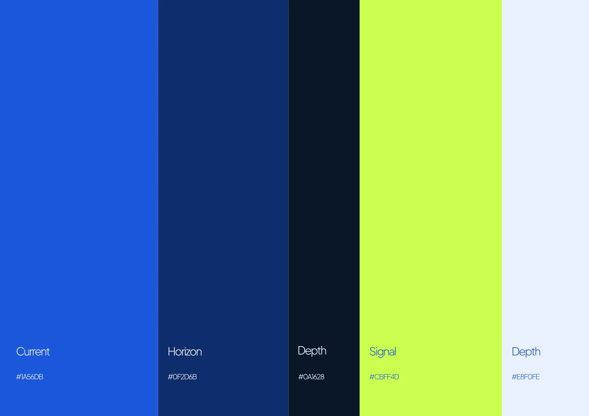
The blues run from an electric, possibility-charged Current down to a near-black Depth, with one acid-lime accent, Signal, breaking through only where something needs to be noticed. The palette isn't decorative. It's closer to a mood board than a swatch sheet, each shade doing an emotional job before it does a visual one. That's also why the names avoid anything functional. Nothing here is called "Primary" or "Accent." The color is the message.
Motion Without Rigidity
The layouts sit on a disciplined grid, but nothing in the photography holds still. Water ripples. Fog drifts. Fabric folds. Even the lime shapes in the mark read less like a fixed icon and more like a burst caught mid-motion. The system stays structured underneath while feeling alive on the surface, calm engineering with a current running through it.
Extending Into the Real World
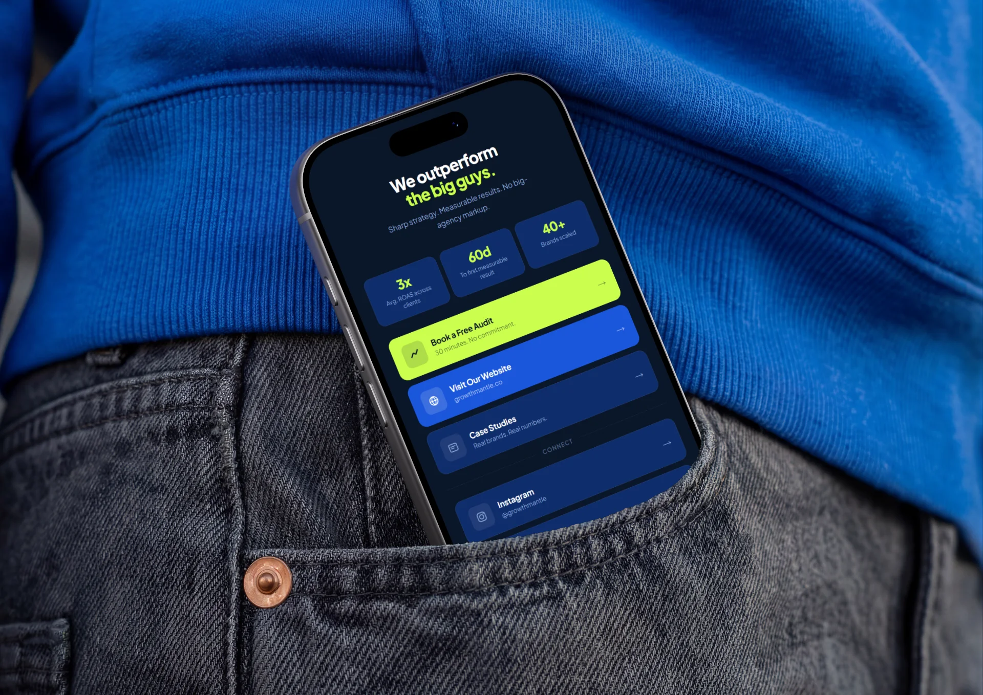
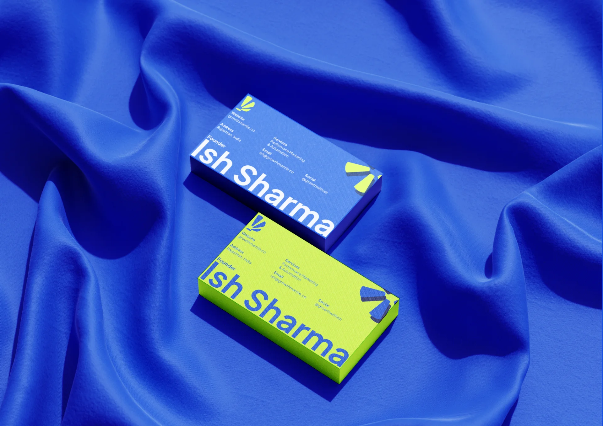
The identity carries the same restraint into every physical and digital touchpoint: business cards with names cropped past the card's edge, an on-site mobile experience that opens with the brand's central claim before a single stat loads, an outdoor mural built from nothing more than a tagline and two shapes of green on blue. Every application repeats the same argument. Quiet confidence, at scale, without needing to raise its voice.
Growth Mantle's identity doesn't try to convince anyone it's serious. It simply behaves like it already is. That's the harder brief, and the one Aganta Foundry built for.
See the full system at agantafoundry.com.
Complete Identity System
Below is the full flow of assets and environments created for the Growth Mantle brand system: